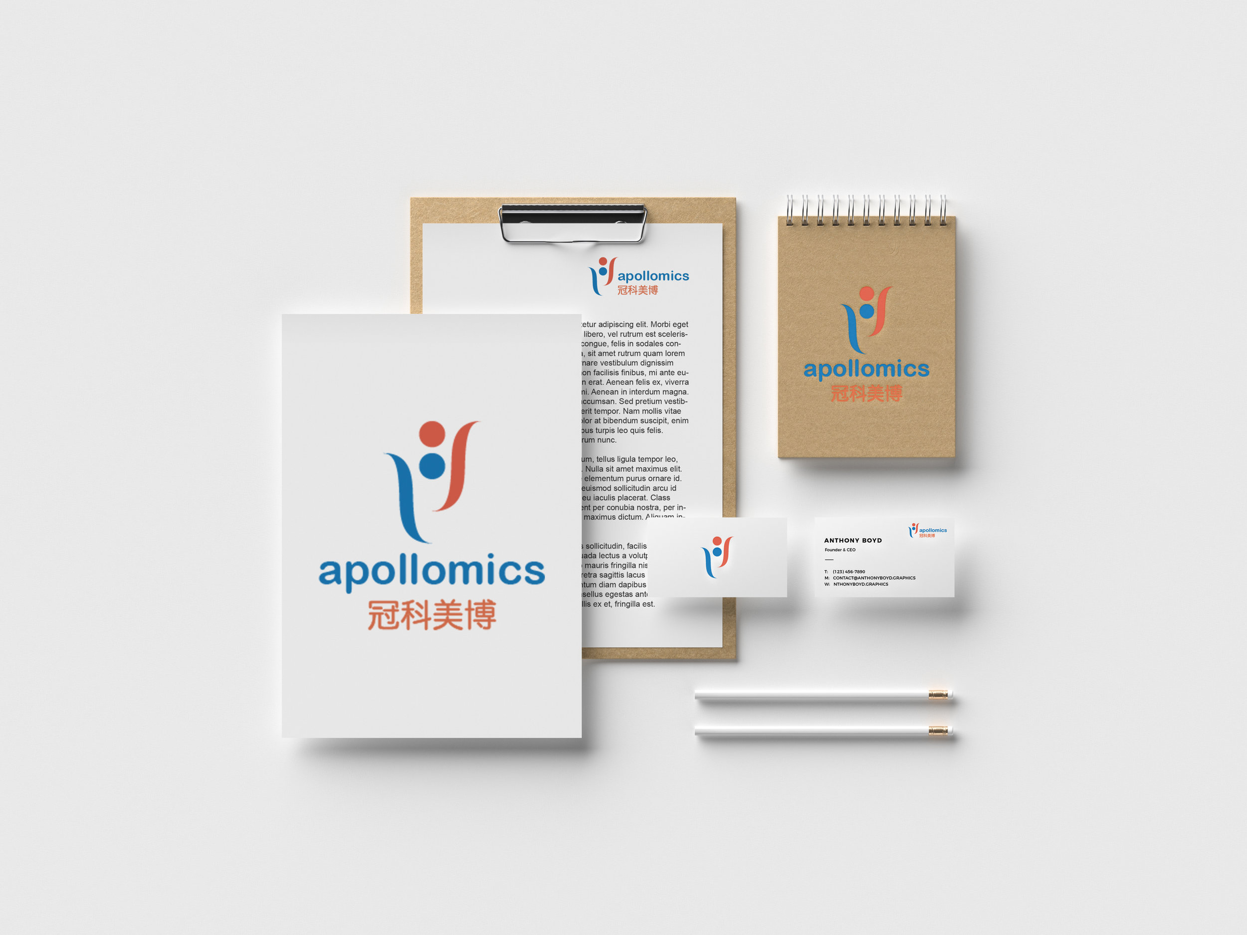
Apollomics Branding
Client: Apollomics
Date: September 2018 - December 2018
Scope: Research, Brand Identity, Graphic Design
Apollomics needed a brand identity that communicated their values of great scientific innovation and creativity.
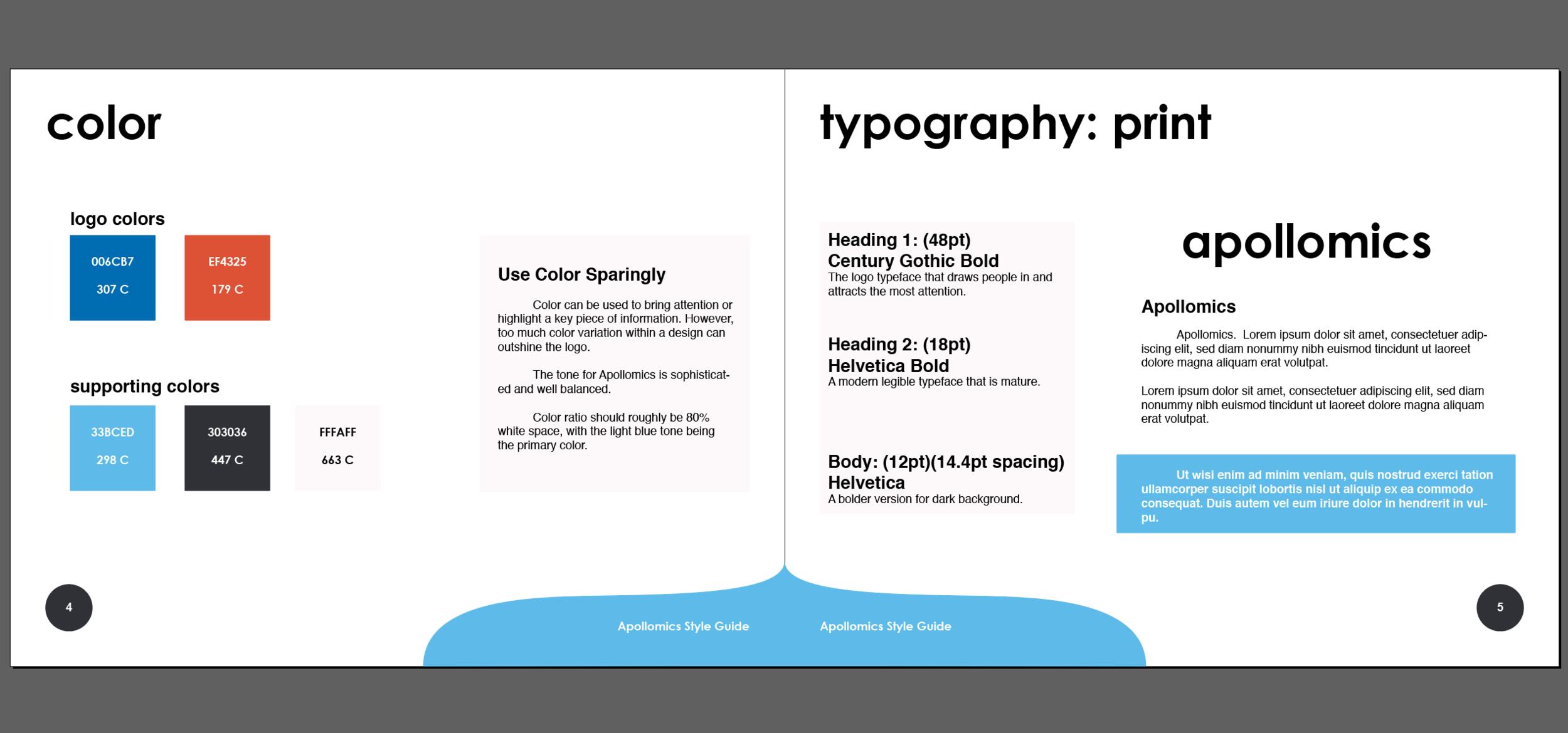
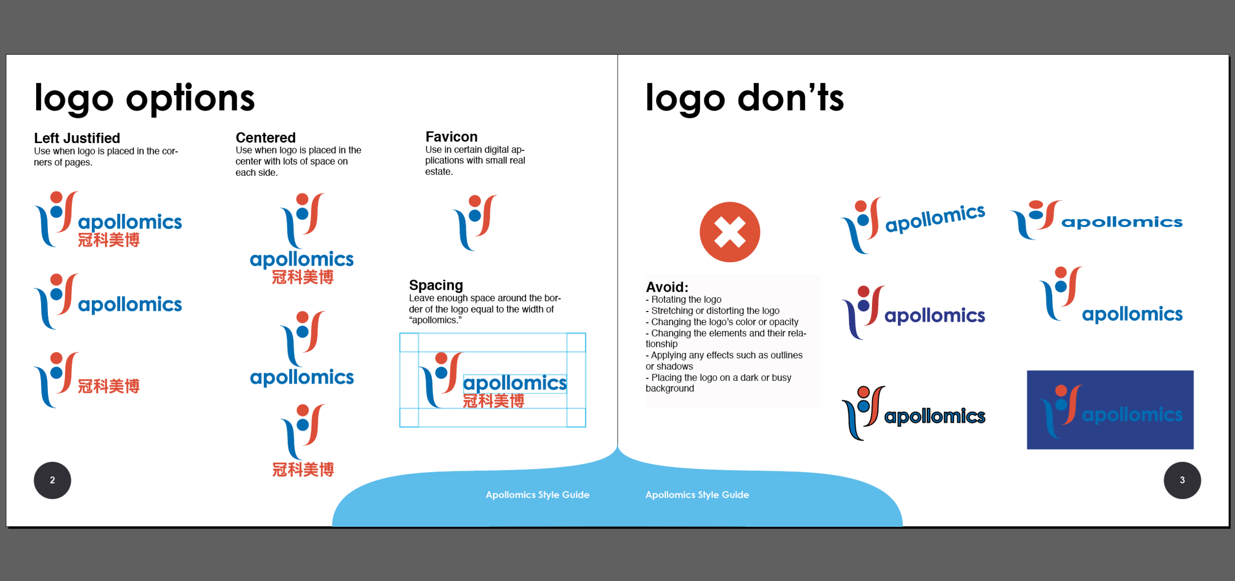
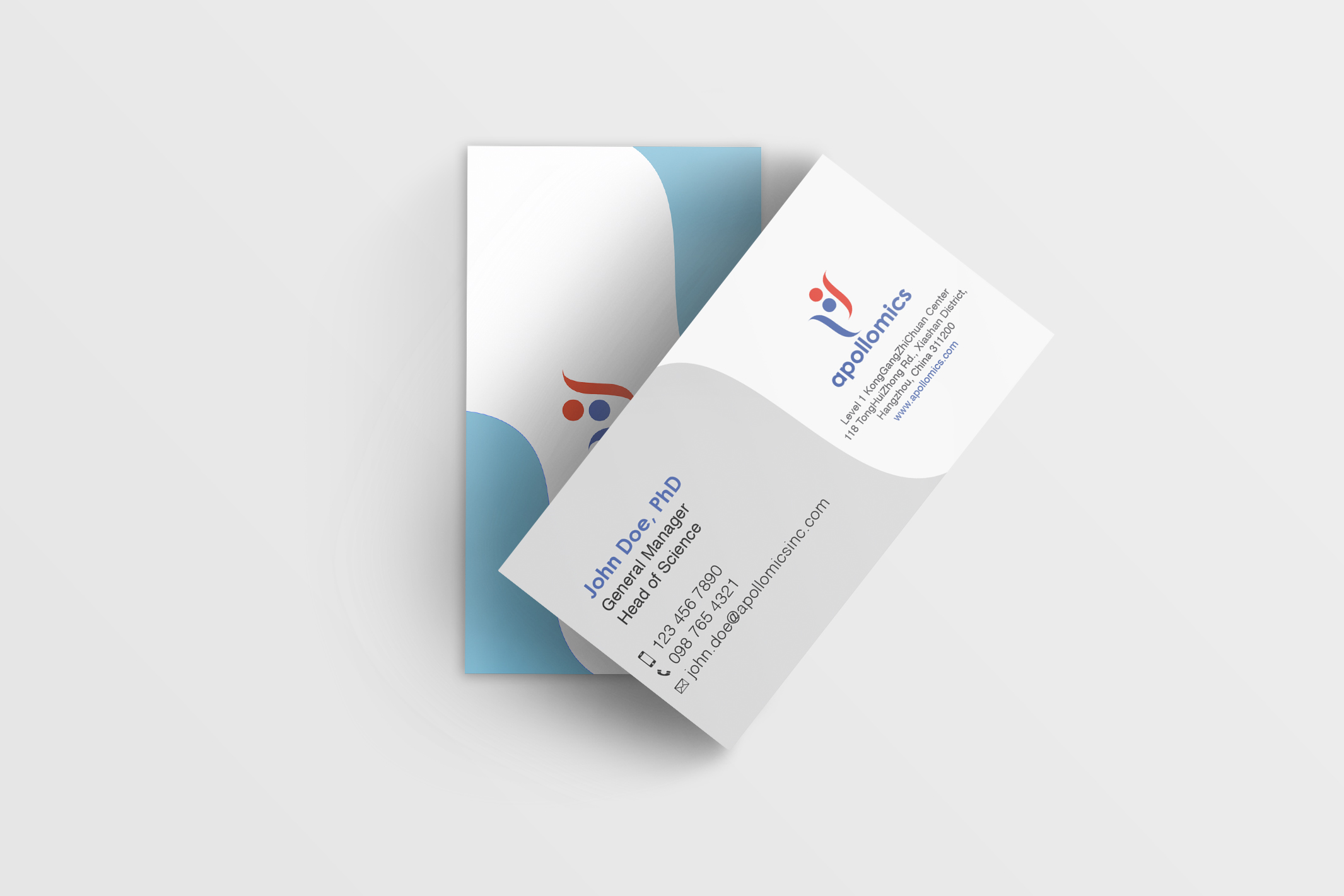
I worked closely with their CEO, founders, and creative team to understand the brand values they wanted to communicate. I used a marketing framework to understand their target audience, company culture, and messaging they wanted to convey. I used the symbols of Apollo and how he represented both health and destruction. The logo has elements of the lyre, a symbol of Apollo, and is abstracted to look like two people in lively expression. The symmetry represents the balance of thoughtful science with creative innovation. I developed this further into a full visual identity.


